Introduction to the Ravens Logo
When you think about powerful sports branding in the National Football League, one emblem that immediately stands out is the ravens logo of the Baltimore Ravens. It’s bold, mysterious, and unmistakably fierce—qualities that perfectly reflect the identity of the team it represents. But there’s far more to this logo than just a stylized bird head. It carries history, controversy, literary inspiration, and a deep connection to the city of Baltimore.
The ravens logo is not just a visual asset; it’s a storytelling device. It communicates strength, intelligence, and a sense of darkness that sets the team apart from more traditional sports branding. Fans don’t just wear it—they connect with it. Whether it’s printed on jerseys, helmets, or merchandise, the logo has become a symbol of pride for an entire fanbase.
In this comprehensive guide, we’ll explore everything about the ravens logo—from its origins and evolution to its deeper meanings and cultural significance. By the end, you’ll understand why this logo is considered one of the most compelling designs in professional sports.
The Origins of the Ravens Logo
The story of the ravens logo begins in 1996, when the Baltimore Ravens were established as an expansion team. At the time, the franchise needed a strong identity that would resonate with fans and reflect the city’s character. The name “Ravens” itself was inspired by the famous poem “The Raven” written by Edgar Allan Poe, who had strong ties to Baltimore.
This literary connection played a significant role in shaping the team’s branding. The ravens logo needed to evoke mystery, intelligence, and a slightly ominous tone—qualities deeply embedded in Poe’s work. The early design featured a shield with a raven, but it didn’t fully capture the aggressive and modern look the team was aiming for.
Interestingly, the original logo design became the center of a legal dispute. A security guard named Frederick Bouchat claimed that the team had used his design without permission. The case went to court, and while the team retained the right to use the logo, the controversy ultimately led to a redesign.
This early phase of the ravens logo highlights how branding is not just about creativity but also about ownership, originality, and authenticity. It set the stage for the development of a more refined and legally secure emblem that fans recognize today.
Evolution of the Ravens Logo Over Time
Like many iconic sports logos, the ravens logo has evolved significantly over the years. Each iteration reflects changes in design trends, team identity, and fan expectations.
The original 1996 logo featured a detailed raven perched on a shield with a “B” for Baltimore. While it had a classic feel, it lacked the sleekness and aggression that modern sports branding demands. After the legal issues surrounding the design, the team introduced a new logo in 1999.
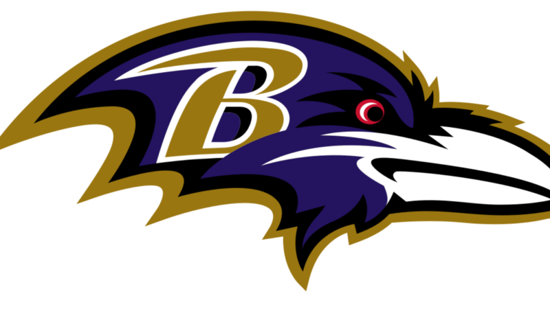
This updated version is the one most fans recognize today. It features a stylized raven head in profile, with a sharp beak and a fierce expression. The letter “B” is prominently displayed on the bird’s head, reinforcing the team’s connection to Baltimore. The color scheme—black, purple, and gold—adds a regal yet intimidating presence.
Over the years, minor tweaks have been made to improve clarity and adaptability across different media. However, the core design has remained consistent, which is a testament to its effectiveness. Unlike some teams that frequently overhaul their logos, the Ravens have maintained a strong visual identity.
The evolution of the ravens logo demonstrates the importance of balancing tradition with innovation. By refining rather than reinventing their emblem, the team has preserved its identity while staying relevant in a competitive league.
Design Elements of the Ravens Logo
At first glance, the ravens logo may seem straightforward, but a closer look reveals a carefully crafted design filled with intentional elements.
The most prominent feature is the raven head itself. It is angled forward, giving a sense of motion and aggression. This positioning makes the logo feel dynamic rather than static, which is crucial for a sports team that thrives on energy and action.
The use of color is equally significant. Black represents strength and dominance, while purple adds a sense of royalty and uniqueness. Gold accents provide contrast and highlight key features of the design. Together, these colors create a visually striking combination that stands out both on and off the field.
Another key element is the “B” on the raven’s head. This subtle yet powerful detail ties the logo directly to Baltimore, ensuring that the team’s identity is always front and center. It’s a clever way to incorporate typography into a largely graphical design.
Overall, the ravens logo is a masterclass in sports branding. Every element—from the shape of the beak to the choice of colors—serves a purpose. It’s not just about looking good; it’s about communicating a message.
Symbolism and Meaning Behind the Ravens Logo
The ravens logo is rich in symbolism, drawing from both literary and cultural influences. At its core, the raven is a symbol of intelligence, mystery, and transformation.
In many cultures, ravens are seen as highly intelligent birds capable of problem-solving and adaptation. This aligns perfectly with the qualities of a successful football team, which must think strategically and adapt to different situations during a game.
The connection to Edgar Allan Poe adds another layer of meaning. His poem “The Raven” is known for its dark, haunting themes, which are reflected in the logo’s design. This literary influence gives the team a unique identity that sets it apart from others in the league.
The aggressive expression of the raven also symbolizes competitiveness and determination. It’s not just a bird—it’s a warrior, ready to defend its territory. This resonates strongly with players and fans alike.
Ultimately, the ravens logo is more than just a visual mark. It’s a symbol of identity, culture, and values. It tells a story that goes beyond the game itself.
The Role of the Ravens Logo in Team Identity
For the Baltimore Ravens, the logo is a central part of their identity. It’s the face of the franchise, appearing on everything from helmets to merchandise.
Players wear the logo with pride, knowing that it represents not just their team but also their city. It’s a symbol of unity, bringing together fans from different backgrounds under a common banner.
The logo also plays a crucial role in marketing and branding. It helps the team stand out in a crowded league, attracting new fans and maintaining loyalty among existing ones. A strong logo can make a significant difference in how a team is perceived.
In many ways, the ravens logo is as important as the players themselves. It’s what people see first, and it’s what they remember long after the game is over.
Cultural Impact of the Ravens Logo
The ravens logo has had a significant cultural impact, both within Baltimore and beyond. It has become a symbol of pride for the city, representing resilience and determination.
Fans proudly display the logo on clothing, accessories, and even tattoos. It’s more than just a sports emblem—it’s a badge of identity. For many, supporting the Ravens is a way of expressing their connection to Baltimore.
The logo has also influenced popular culture, appearing in various forms of media and inspiring countless designs. Its unique combination of colors and imagery makes it instantly recognizable, even to those who may not follow football closely.
In a broader sense, the ravens logo demonstrates the power of effective branding. It shows how a well-designed symbol can transcend its original purpose and become a cultural icon.
Comparison with Other NFL Logos
When compared to other teams in the National Football League, the ravens logo stands out for its boldness and originality.
Many NFL logos feature animals or mascots, but few are as stylized and dynamic as the raven. The sharp lines and aggressive posture give it a modern edge that sets it apart from more traditional designs.
For example, some teams opt for simpler, more classic logos that emphasize heritage. While these designs have their own appeal, they often lack the visual impact of the ravens logo. The Ravens have managed to strike a balance between tradition and innovation, creating a logo that feels both timeless and contemporary.
This distinctiveness is one of the reasons why the ravens logo is so effective. It doesn’t just blend in—it commands attention.
The Ravens Logo in Merchandise and Marketing
The ravens logo plays a vital role in the team’s merchandise and marketing efforts. It’s featured on a wide range of products, from jerseys and hats to mugs and phone cases.
Fans are drawn to the logo because of its striking design and strong symbolism. It’s not just about supporting the team—it’s about owning a piece of its identity. This emotional connection drives sales and helps build brand loyalty.
The logo is also used in advertising campaigns, social media, and promotional materials. Its versatility makes it suitable for various applications, ensuring consistency across different platforms.
In the world of sports marketing, a strong logo can be a powerful asset. The ravens logo is a perfect example of how design and branding can work together to create a successful franchise.
Why the Ravens Logo Remains Timeless
Despite changes in design trends, the ravens logo has remained largely unchanged since its introduction in 1999. This consistency is a key factor in its success.
A timeless logo doesn’t rely on fleeting trends. Instead, it focuses on strong design principles that remain relevant over time. The ravens logo achieves this through its bold shapes, balanced composition, and meaningful symbolism.
Another reason for its longevity is its emotional connection with fans. Once a logo becomes part of a team’s identity, changing it can be risky. The Ravens have wisely chosen to refine rather than replace their emblem.
This approach has allowed the ravens logo to stand the test of time, remaining as impactful today as it was when it was first introduced.
Conclusion: The Legacy of the Ravens Logo
The ravens logo is more than just a symbol—it’s a legacy. From its origins in literary inspiration to its evolution into a modern sports icon, it represents the journey of the Baltimore Ravens and their fans.
Its design combines artistry and meaning, creating a powerful visual identity that resonates on multiple levels. Whether you’re a die-hard fan or simply an admirer of great design, it’s hard not to appreciate the thought and creativity behind this emblem.
As the team continues to grow and evolve, the ravens logo will remain a constant—a symbol of strength, intelligence, and pride. It’s a reminder that in the world of sports, a great logo can be just as important as the game itself.